There are few marketing practices more misunderstood than conversion rate optimization.
Some businesses see it as an unnecessary expense that doesn't really move their business goals.
Most others see it as a silver bullet for all their marketing woes. From growing traffic to converting more leads, CROs are often expected to do it all.
Some of these misconceptions are harmless. Others, however, can cost you money, time and valuable resources.
So in this post, I'll clear some of the common misconceptions about conversion rate optimization that are hurting your website and your business.
1. CRO is a single skill
One of the biggest misconceptions among businesses is an entrenched belief that CRO is a single skill set.
They might even call upon their “CRO guy” when they want to get more conversions from their sites.
In truth, CRO is a broad practice that encompasses a wide range of skills. To be effective at conversion rate optimization, you need at least three different skill sets:
- Copywriting: Whether or not you can write persuasive copy will have a big impact on your final conversion rates.
- Design: From your site's UI/UX to its choice in graphics, every design element on your site impacts conversion rates. You'll need a skilled UI/UX designer with knowledge of conversion rate optimization.
- Analytics: You'll need someone with the necessary skills to run tests and analyze their results.
Depending on how you run your tests, you might also need a developer to code up page variants.
Keep this in mind whenever you approach the idea of using CRO on your site.
2. Conversion rate optimization (CRO) is all about following “best practices”
I'm sure you must have stumbled upon best tips and tactics blog posts to boost your conversion rate. You may have also gone ahead and tried to implement those so called best practices but did they really work?
And if they did, do you really know why they worked?
The truth is that there are no one-size-fits-all “best practices” you can apply to your industry that will be guaranteed to work.
Your focus must be on how you can remove true barriers that are hindering with the flow to improve conversion rather than making little changes that worked for someone else.
For example, a common piece of advice for creating CTAs is to use a color like green (traditionally associated with nature or “go”).
Yet, when this best practice is put into practice, it doesn't always hold up.
In one study, changing from green to red colored buttons actually increased conversion rates by 21%.

Understand that conversion rate optimization is not a checklist that you can run down.
Instead, see it as a holistic practice where you aim to create a compelling user experience without sacrificing revenue. Your goal is to figure out your specific customers and what will work on your specific website.
To do this, you need to:
- Conduct your own audience research to understand what your users really want.
- Conduct an audit to see where users are dropping off from your website.
- Based on above information, implement changes and A/B test them.
Keep in mind that average A/B testing takes 4 weeks to run, so there is no point trying every possible “101 best practices”.
Here's an example:
Plenty of studies show video is better for conversions than static images or text.
Based on this, Brookdale Living, a community living service for seniors, tested two variants of its homepage – one with a static image:
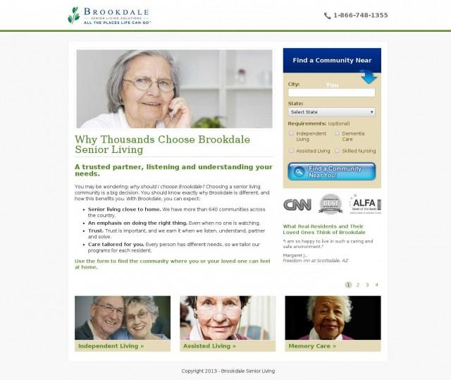
And one with a video.

If you had to go by “best practices”, you'd assume the video page to win.
Yet, results showed that the static image variant had more engagement and drove more revenues (over $100,000 more).
Here's another example:
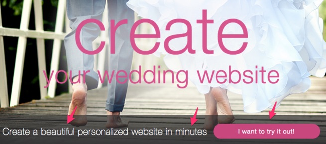
WedBuddy, a SaaS tool that helps couples create wedding websites, had a landing page that emphasized its free trial:

On paper, this makes perfect sense. After all, the word “free” is associated with higher click-throughs and sign-ups, especially when offered as a trial.
WedBuddy, however, realized that emphasizing the “free” nature of the service actually harmed conversions. People who signed-up thinking that the service would be free were harder to convert into paying customers.
To counter this, WedBuddy changed its landing page copy to focus on value instead of the “free trial”:
That's not the only change WedBuddy made.
It also went against convention and actually decreased the number of testimonials and list of benefits.
The final page was significantly shorter and had less social proof than the original variant:
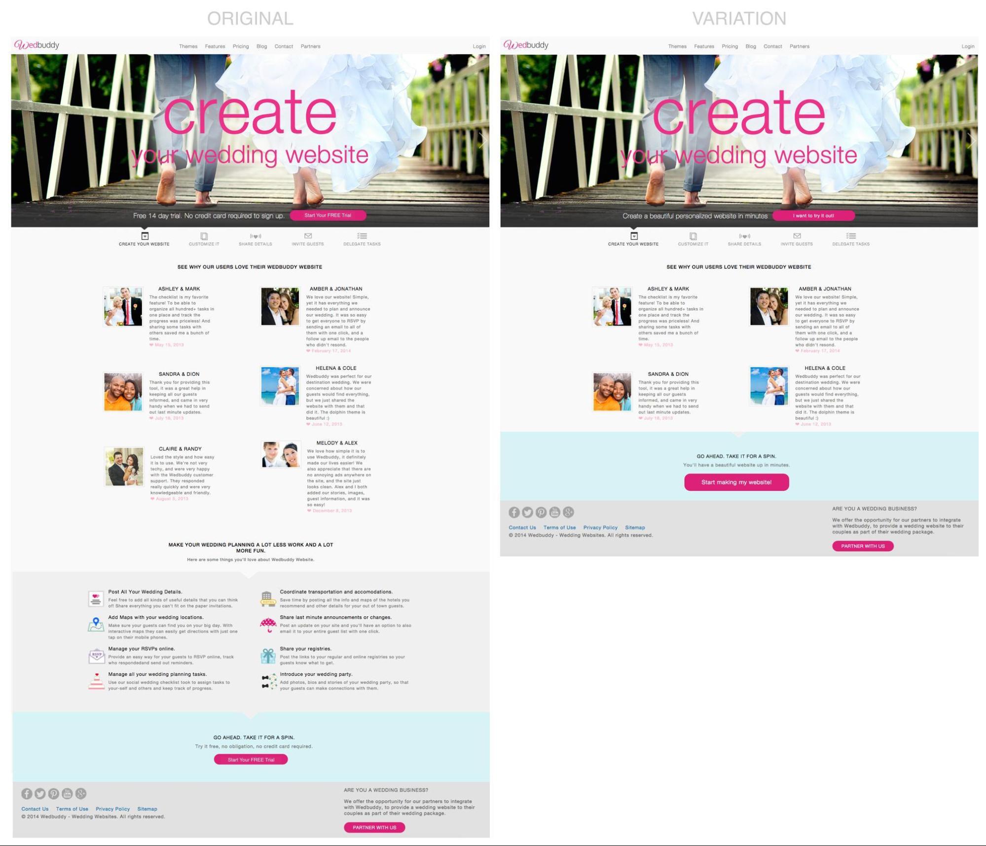
The result?
139% increase in clicks and 73% increase in free trial sign-ups.
The lesson: don't blindly copy best practices. Instead, test them out and use them only if they actually help your target audience. For every case study proving a “best practice”, you'll also find 5 others that prove the contrary.
3. Conversion rate optimization is all about making small changes that lead to big rewards
You might have seen case studies like these:

Here, changing a single word (“my” instead of “free”) resulted in 90% more clicks.
Going by such case studies, you might be tempted to find that silver bullet where making a small change will reap big rewards.
In truth, case studies like these are incredibly misleading and give you only partial information.
They don't tell you:
- How long the test was done.
- Whether the traffic remained constant throughout the testing period.
- What other changes were made on the site.
If you really want to double your conversion rate, focus on following a framework that tests all elements of your site that get in the way of user experience and conversions.
Don't try to find these “holy grail” small elements. Take more risks by drastically redesigning your site with new a layout, color and images.
4. Conversion rate optimization is just about split testing
For most people conversion rate optimization is all about split testing site elements.
The truth is that CRO is all about identifying the actions of your users that lead to them buying from you. A CRO consultant's job isn't just to create tests; it is to identify and fix barriers to conversion on a site.
To do this, start off by asking yourself if your user's basic needs are met or not. Try to understand your user's psychology and what prevents them from buying your product.
You don't even need a lot of traffic for this. A basic usability test using the “think aloud protocol” may reveal plenty of user-experience roadblocks.
Here's a good model to work out what to focus on:
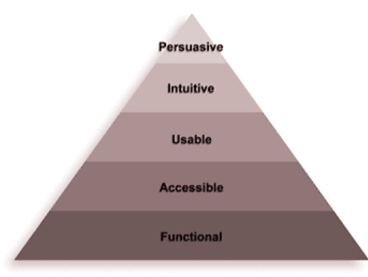
Based on this, your CRO practice should focus on the following (in decreasing order of priority):
- Functionality: Can the site perform basic functions? Does it work across devices? Are the buttons clickable?
- Accessibility: Is the site accessible to all users, regardless of their abilities, devices or locations?
- Usability: Is the site usable? Can people actually use it without guidance to find what they want?
- Intuitivity: Can users intuitively figure out the site's navigation and content?
- Persuasiveness: Is the site persuasive? Can it convince users to hand over their contact information or purchase a product?
You shouldn't completely ignore A/B testing altogether, but rather know when it is appropriate to implement.
5. No one reads long sales copy
“People don't read anymore”
“They have short attention spans”
“People are already too distracted”
These are all common refrains you've likely heard a thousand times.
This leads many businesses to believe that long sales copy can't sell.
In truth, people are now reading more than ever. Specially when someone becomes interested in any activity of actual commercial value, such as starting a business or getting a new job.
This popular post by Neil Patel on online marketing, for example, is over 30,000 words long, yet it has hundreds of shares and backlinks.

In fact, an analysis of over 1M search results by Backlinko found that longer content consistently outranks shorter content because people perceive longer content to have more value.
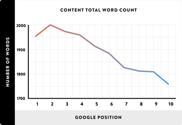
In his book Ogilvy on Advertising, David Ogilvy says:
“All my experience says that for a great many products, long copy sells more than short … advertisements with long copy convey the impression that you have something important to say, whether people read the copy or not.”
If your copy offers strong benefits that's relevant to the reader, they will read every word of it.
As the advertising adage goes, “The more you tell, the more you sell.”
For example, Moz tested a longer landing page which resulted in a 52% increase in sales:
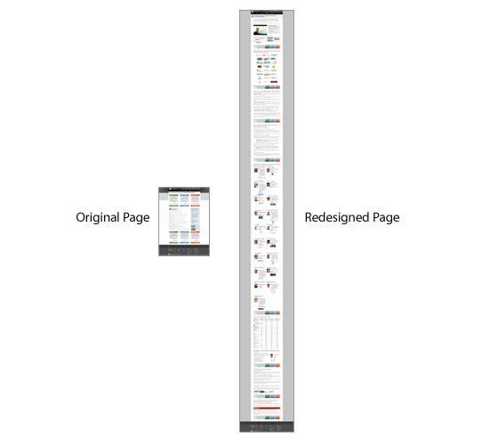
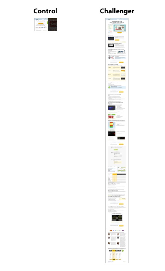
Similarly, Crazyegg's longer homepage increased the site's conversion rate by 363% by making the homepage about 20 times longer.
6. Your user demographics and audience personas don't matter
Stop telling yourself that:
- You don't need to survey or talk to your target audience.
- You know your audience very well.
- You know what's exactly going on in your audience's minds.
- You make changes according to what you think is right and your audience must follow.
Wrong.
Regardless of the industry you're in, there is a very good chance your marketing is reaching to many different customer profiles in different demographics who would naturally have different motivations.
The wider your range of products, the more customer profiles and demographics you'll target.
For example, let's say you're selling beer online. A customer who just turned 18 would have different motivations to buy your product as compared to a 50 year old man who wants have a pint after a hard day's work.
Do you really think it is possible to think about all the market segments without doing any user research? There will be people with all kinds of personalities that will visit your website.
Some may want to have an in-depth description of how you brew your beer. Some would just buy looking at the reviews.
If you want your visitors to convert, get their feedback and use that information to craft changes accordingly.
Worse, lots of businesses believe that if they simply copy the design and copy of a successful website, they too can experience a massive increase in conversion rate, regardless of what their users are actually like.
Wrong. Again.
Successful websites convert better because they create an experience tailor made for their users. They research their audience and give them something they want.
Conversion case studies are there not for you to copy exactly, but for you to gain insights from.
7. If you focus on CRO alone, you can build a successful business
Because of all the love CRO has received of late, some businesses believe that if they win the CRO game their online business will start to shine.
CRO may help you increase your conversion rate from 1% to 2% which in turn will have a big impact on your sales. For it to work, however, you still need to get traffic, create a brand and keep attracting customers back to your site.
For instance, if you're selling a $100/month product with a 1% conversion rate and 10,000 visitors/month, there are multiple ways you can double your earnings:
- Improving conversion rate to 2%.
- Increase traffic to 20,000 visitors/month with the same conversion rate.
- Reduce customer churn.
- Increase conversion rate to 1.25% and traffic by 6,000 visitors.
Focusing on CRO is great since it gives you a solid, data-driven foundation for converting customers and generating leads. This doesn't mean that you should neglect other aspects of your business such as marketing, sales and the product itself.
8. You need to create a uniform experience for all your customers
For most businesses, creating a high converting page is a big deal.
But is it really okay to use that same landing page for all your visitors?
Your website is getting traffic from all sorts of channels – Facebook, Twitter, Youtube, Google, etc. Each of these customers come from a different context in mind and has different expectation from your website.
A user coming in from search expects to find answer to his query, while someone coming in after clicking a picture on Twitter expects something else.
To tackle this issue, if resources permit, try creating separate landing pages for users coming in from different channels.
For example, a few guest bloggers welcome users on a separate landing page instead of the home page when they click on “About The Author” section.
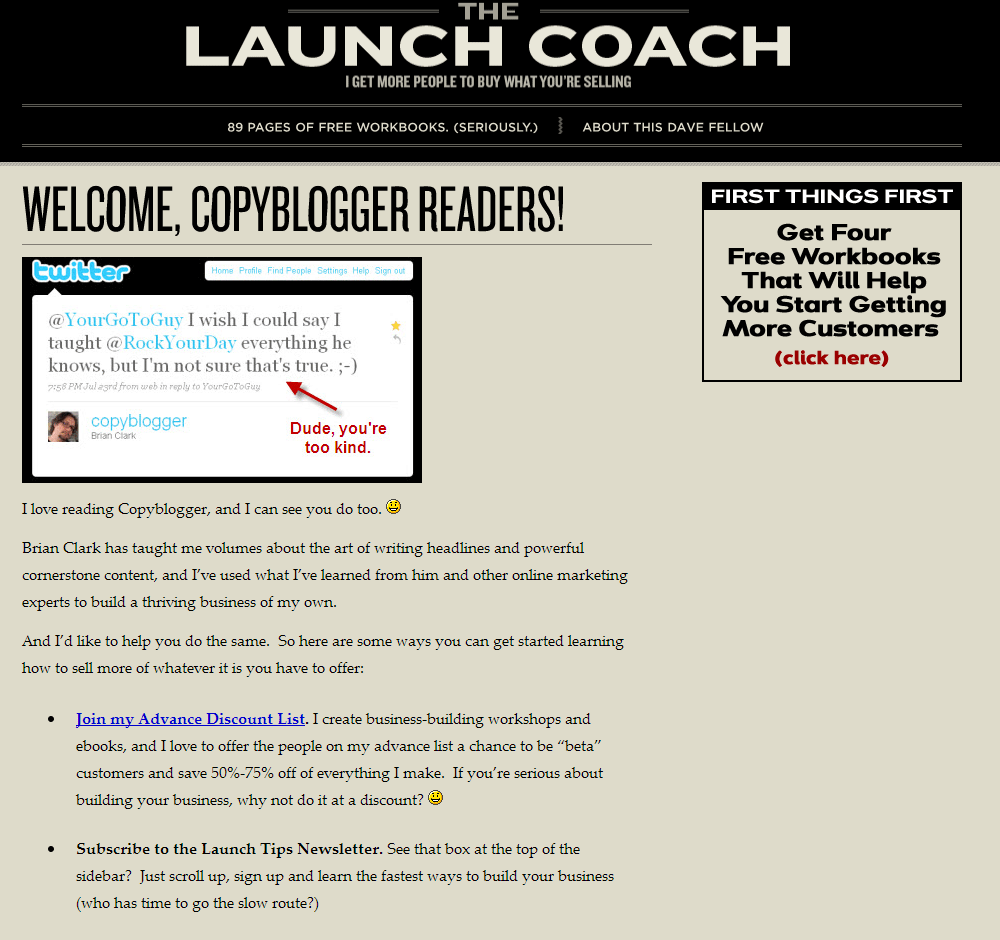
Similarly, Darren Rowse of ProBlogger links to his “About” page on ProBlogger's Twitter profile.
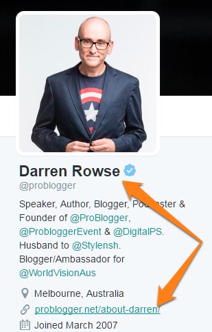
This works since the ProBlogger handle is tied to Darren. It makes sense to give readers coming from Twitter a better background on Darren, the person and the blogger.
Expedia's Twitter profile, on the other hand, links to the Expedia Viewfinder travel blog instead of the flight search page.
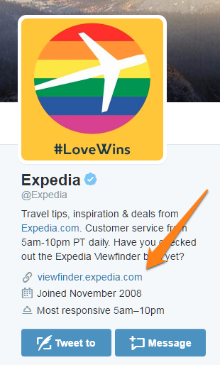
This is appropriate since people coming in from social media aren't necessarily looking for flights. Instead, Expedia wants to offer them a brand experience through its blog.
Try this on your own landing pages. Understand the expectations of your users and create an experience tailored for them.
9. Conversion is the only metric you should care about
What really is the end goal of CRO?
Conversion? Yes.
But who are you really trying to convert? For many visitors that come to your website (for the first time) conversion is a process. It may happen on their first visit, or it may happen on the tenth visit.
You can show them how they can buy your product and remove all the barriers standing in their way, but ultimately they will have to make the decision.
While conversion rate is important, it is only a part of the whole process. Instead, you should also pay attention to other meaningful metrics like – Visitor Recency (how long between visits) and Visitor Loyalty (how frequently people visit), etc.
Conclusion
CRO has the potential to make a major difference in your conversion rate, but only if you're willing to take a structured and systematic approach that relies on data and not myths and preconceived notions.
Before testing out anything you must understand your users and their problems. Stop all the guesswork and get down to do some user research. Workout the exact reasons why visitors aren't converting and implement the correct solution(s). Do this consistently enough and you'll never struggle with poor conversion rates again.
About the Author: Khalid Saleh is the co-founder and CEO of conversion optimization company Invesp, a leading provider of conversion rate optimization landing page optimization solutions.
No comments:
Post a Comment